Advertising:Key conventions
1) What key conventions of print adverts can you find and what are the connotations or deeper meanings of each convention?
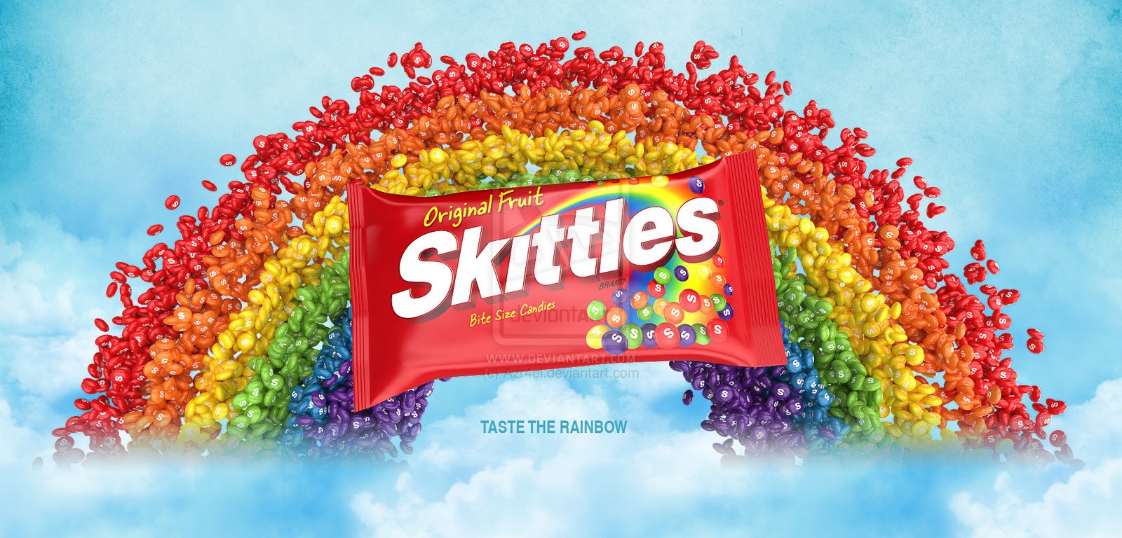
Pictures you can see a clear image of the product itself (skittles).It shows the audience what the actual product looks like before they consider buying it.It also links to the slogan 'bite size candies' because the product is seen as a perfect bite size.
The logo is big and bold and also stands out since it is white.It highlights the packet because it stands out from the red.A hidden meaning behind skittles is that on the 's' of each skittle it stands for 'made of sugar'.
The background of the advert has a rainbow.A rainbow connotes happiness and joy.This would make the audience want to buy it because of the use of colours.This is seen as very appealing towards children because they like rainbows.
There are two slogans towards this advert one is 'original fruit' this shows the reader/audience that even though this is a sweet delicious treat it is still made from the original fruit itself.The second slogan towards the advert is 'bite size candies' this links to the product itself because as we can see in the picture the candies are actually bite sized.It also shows the reader/audience that this is seen as a treat.
The colour scheme of the advert is the colours of the rainbow.This is a USP because no other brand has done that before.


Comments
Post a Comment